From Learn Page to Notebook Page — What Elearner Taught Me About How We Actually Learn
I previously wrote about Elearner and the motivation behind building it in another article: Why I Built Elearner: A Platform Designed for Learning
In this post, I want to talk about something different: what happened after I started using the product myself.
Specifically, this article is about my experience moving from Version 1 of the UI to Version 2, and the key realization that forced this redesign. The short version is this:
I initially designed the product around the concept of a Learn page, but real usage revealed something more fundamental: the notebook is the true center of the learning workflow — everything else should revolve around it.
Version 1: Organizing Learning in One Place
When I started building Elearner, my requirements were simple. I wanted a platform that combines the following components in one container called a Learn:
- •notes
- •resources
- •flashcards
A Learn groups everything related to a topic so that learners can easily access their materials without:
- •Mixing learning resources with browser bookmarks, which leads to losing track of useful references
- •Managing dedicated documents in tools like Notion for separation and organization purposes
While designing the Learn page, I had an important question: "How should these different components be presented to the learner?"
My initial decision was to use tabs.
The idea was simple: showing multiple lists on the same page might overwhelm the user, so tabs could hide everything except the currently relevant section.
The goal of Elearner is to help learners study efficiently and with focus. Deep learning often requires entering what psychologists describe as a flow state. Showing too many elements on the screen could easily disrupt that focus.
Tabs seemed like the right solution — but once I started using Version 1, I noticed something interesting.
The First Signal That Something Was Wrong
Two behaviors kept repeating themselves during my own learning sessions.
- Creating Flashcards: When writing a flashcard, I often needed to review my notes, but opening the Flashcards tab closed the Notebook tab, so I started opening a second browser tab just to keep the notebook visible.
- Reviewing Resources While Taking Notes: A similar issue appeared with resources. While taking notes, I sometimes wanted to quickly revisit an article or video I had saved earlier, but switching to the Resources tab closed the notebook again, once more I found myself opening another browser tab to keep the notebook visible.
At first, these looked like minor inconveniences. But after repeating the same workarounds multiple times, I realized something important:
The problem wasn't the feature.
The problem was the mental model of the interface.
The Realization: The Notebook Is the Center of Learning
To understand why this problem existed, it helps to imagine learning without digital tools.
Imagine someone studying with a book, a notebook, and a few sticky notes. The learner reads the material, then writes notes in the notebook.
Over time, the notebook becomes the main reference used for studying and revision. The original material is revisited only when there is a knowledge gap.
When practicing active recall, learners often create questions based on their notes. They test themselves using the notebook rather than repeatedly rereading the original material.
In other words:
The notebook becomes the center of the learning process.
Once I recognized this pattern, the problem with Version 1 became obvious. The interface treated the notebook as just another tab — but in reality the notebook is the core of the entire workflow. Everything else (flashcards, resources, and practice tasks) exists to support it.
Version 2 — Designing Around the Notebook
This insight changed the way I thought about the interface. Instead of asking:
How do we organize the Learn page?
The real question became:
How do we keep the notebook visible while everything else happens around it?
This shift led directly to the redesign in Version 2.
Fixing the Flashcard Workflow
In Version 2, flashcards can now be created directly from the notebook view. When adding a flashcard, the interface splits into two sections:
- •the notebook remains visible
- •the flashcard editor appears alongside it
This allows learners to reference their notes while creating flashcards.
This layout works best on wider screens. I intentionally optimized for this scenario because deep learning sessions typically happen on larger displays where productivity is higher.
Fixing the Resource Workflow
The resource problem required a similar adjustment.
While writing notes, learners should be able to manage or revisit resources without leaving the notebook view. At this point, I started questioning the tab interface more seriously.
Consider how bookmarks work in a browser: when saving a page you don't open a separate interface for bookmarks. Instead, you press Ctrl + D and save it instantly without leaving the current page.
This interaction pattern keeps the user focused on their current context. Browsers already solved this problem elegantly, so I adopted a similar approach for resources in Elearner.
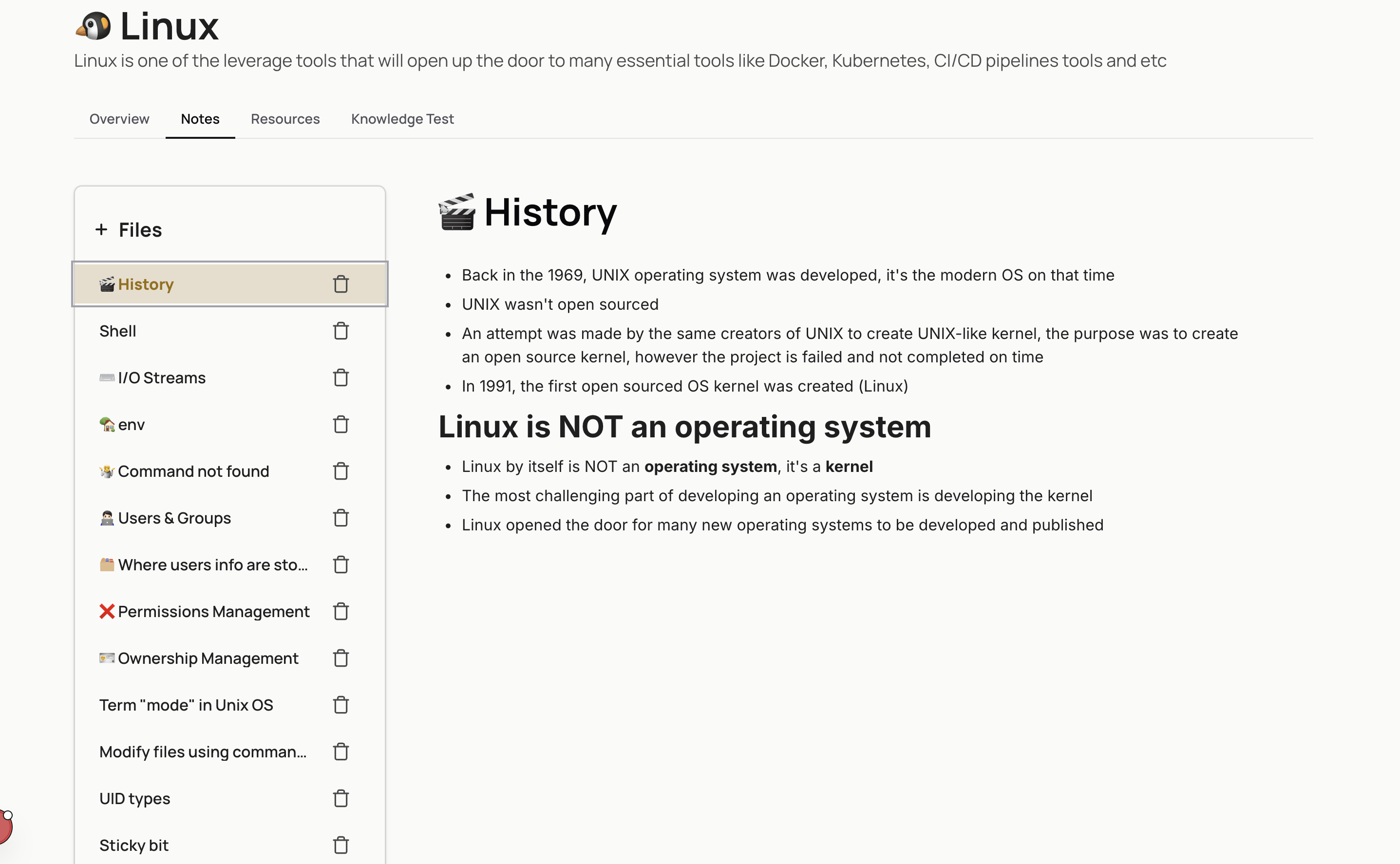
The Final Shift: Notebook Page Instead of Learn Page
Once I embraced the idea that the notebook should always remain visible, another structural change became obvious: the main page should not be the Learn page — it should be the Notebook page.
The notebook is now the primary view, and the supporting tools (flashcards, practice tasks, and resources) live in a sidebar.
From the sidebar, learners can:
- •add items
- •edit them
- •remove them
All of this happens without ever closing the notebook.
The Lesson
Version 1 organized features by separating each feature in a separate tab.
Version 2 organized the workflow.
And that difference came from a simple realization:
The notebook isn't just another component.
It is the center of the learning process.
Once the interface reflected that reality, the product immediately felt more natural to use.